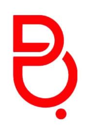
Wow, it seems like logo fever is taking over the country! So after last week's new BTV logo (which we came to the conclusion represented nothing, really), Batelco have come to the scene with their own brand new identity!

Come to think of it, didn't Batelco change their logo just a few years back, when Zain (back then MTC Vodafone) came onto the scene? So why are they changing it again? Here are some quotes from Batelco Chief Executive:
Combining the English "B" with its Arabic equivalent, the aim is to make the company identifiable with all cultures
Aha, all cultures? I don't see the Indian and Chinese culture in there. And in fact, I don't even see Arabic culture; sure there's an Arabic letter ب in there somewhere but mixing it in with the B makes it look like this:

Don't see it? Okay look closer:

Hmm. New spelling needed then, Batelcow? No seriously, what's up with all the logo changes? Changing a logo doesn't mean your company moves up in the World. Batelco's service isn't necessarily bad, it's not great though, and it's the internal issues that need to be fixed, not the external view of the company. Anyway, here are the older logos:
2003:

Prior to 2003:

Funnily enough, the oldest one still seems the most relevant to a telecom. Hmm. Anyway, this means we've had 3 logos over the span of less than a decade. What we should be doing is look at the big global companies around the world and follow their examples! So, have those big companies been changing their logos as often? Let's see some examples:
Coca Cola:
1885:

2009:

Hmm. So essentially Coca-Cola has had the same logo for over 100 years, only changing the font a teeny tiny bit to make it look fresh and more modern. Hmm. Doesn't look like we're following that example. Let's look at another:
Nike:
1971:

1981:

1991:

2001:

Hmm. Guess we got it all wrong then...


6 comments:
Batelco's new logo is very ugly. A logo should be better than the previous one or they should not change it at all!
Batelco's new logo is very ugly. A logo should be better than the previous one or they should not change it at all!
Yeah, I'm not sure about this logo at all ! and way to soon since the last one. which was actually quite nice.
lol! I'm guessing that logo change cost millions and more?
what sux even more is that with the financial crap that is going on with companies closing down around the country, you get these assholes that pay around BD300k for a stupid logo to a forign comoany where a bahraini based company would've designed a better logo for like BD10k or less!
and then they say they dont have money so they start firing people here and there and hire a bunch of foreigners with 3-4 digit salaries...
fuckin bull....
Dude,
In that way, we can't make any circle shape over the cow, and it will fit.
in 1971 Nike had the wordmark over the icon.
Adidas did a rebrand !
Apple Did it 3 times !!
"Brand is not just a logo" ! Apple never sold Apples !! they sold creative products.
Ammar and people who fallow, I suggest you to go and read more about Branding before.
Post a Comment